Scroll it, click it, surf it…
Sounds a little bit like the process I was working through this weekend.
I made the leap and purchased my own domain to download the WordPress software for my webtext project. I can completely understand why “novice” bloggers (like me) are drawn to using the WordPress software: it’s not dramatically different than using the WordPress blogging platform AND you have a lot more flexibility for tinkering. There are hundreds of free themes from which to choose for your blog and – bam! – it looks professional.
Granted, I’m all about learning to code and customize a webpage, but it is liberating to know that there are some ways to ease into the process (a la templates) without looking like a complete newb. I know that I would eventually like to personalize the code on the templates I’m using (after all, how else do I make them uniquely mine?), but for now, I’ve been having some fun just testing out different templates and seeing what works well.
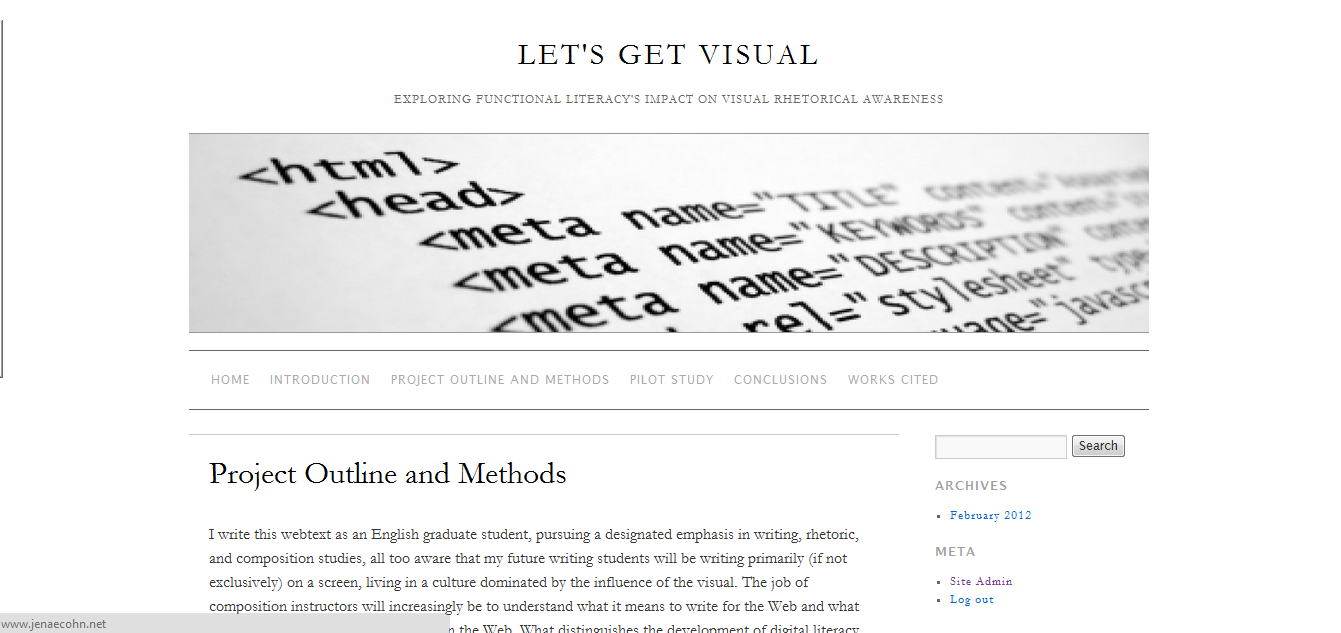
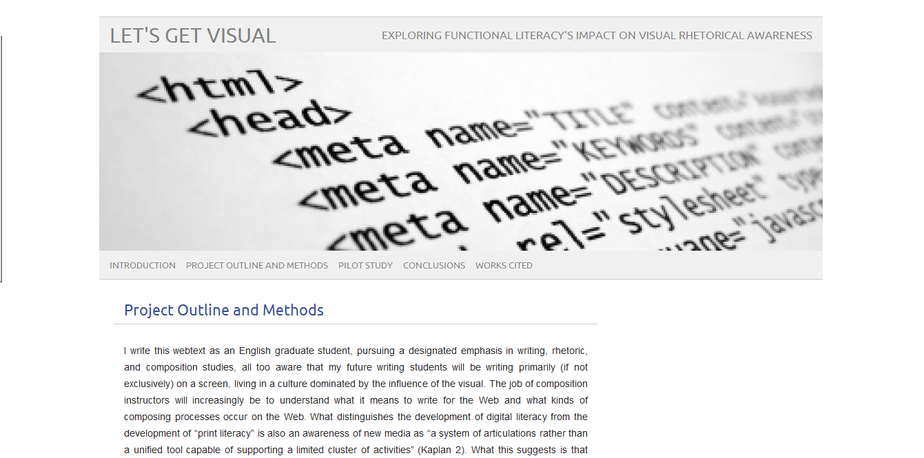
I’m debating between two right now (as my “starter” templates before I tweak) for my final webtext:
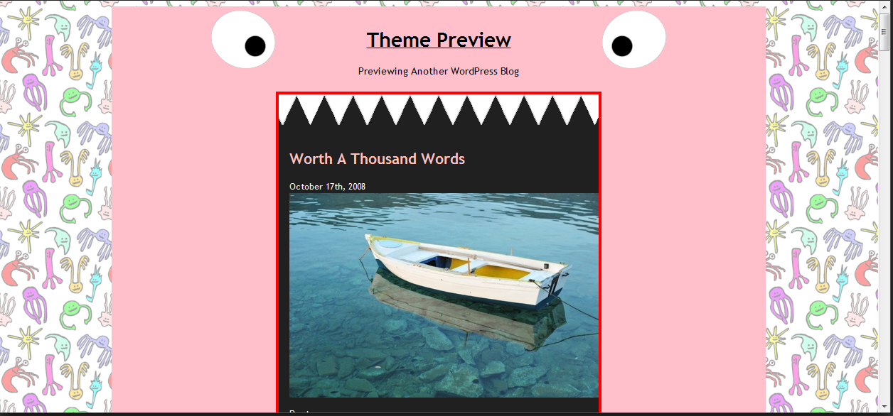
They’re more similar than different. All I knew going into this was that I wanted a kind of “light” minimalist theme for this was a quality that all of my interviewing subjects professed as something they desired in their own web design. It seemed appropriate to mirror their consciousness of what is attractive and, indeed, for an academic project, I think it only makes sense to keep the design simple (thereby drawing primary attention to the content and showing to the reader that, “Yes, this is serious!”). I’m not sure anyone would read my work seriously if I applied, say, this kind of template to it:
My foray into theme shopping aside, I’ve been tinkering around with the two to which I’ve narrowed down (and I really wish I had taken some screen captures of my attempts to make the font size on Brunelesschi larger; what a disaster! My page looked like a cluttered mess).
At this point, I’m really feeling the Pico Light template. I like that the way the header/subpages are all in one block (rather than in separated chunks). It somehow seems to mimic the appearance of a “cover page” more. It also seems to me like the Pico Light template highlights the banner image more, which I think looks rather stark, sophisticated, and serious. All good qualities for an academic webtext!
I could see myself tweaking the font a little bit; the modern sans serif may just be a little too “cold” for my tastes (what can I say? I’m a sucker for a serif) and perhaps I’d try to expand the font sizes on the pages bar so that each of the page titles don’t look so squashed together on the left-hand size. Of course my experiment with Brunlesschi has scared me away from doing that a little bit, but part of tweaking code is persistence; every pixel counts.
Any thoughts, blog readers? Which one do you prefer?


Great post, Jenae! I too like how the Pico Light template highlights the banner image and encompasses the title, subtitle, banner, and section links. The Brunelleschi template uses white space effectively to guide the reader through the page, but it feels more newspaper-ish to me. I vote for Pico Light.
Both templates offer a minimalist design, which is desired for all of the reasons that you mention.
As I look at the Pico Light template, I wonder if you might want to crop the height of the image so that it does not dominate the page as much–cropping would also allow your main text to start 1/3 down the page as opposed to 1/2 down the page (which means a lot more scrolling). It would be nice, too, if the title stood out more–if it was the first thing the reader sees. Perhaps a larger typesize or darker color would do the trick?
Your webtext is really taking shape! I’m thrilled that the WordPress software is working out. Very exciting stuff.
I’m between Brunelleschi and the Monster Theme. The latter would certainly give your scholarly research a “fun, and totally appropriate for all ages” feel.
Final vote: Brunelleschi.